Designing an Engaging Dog-Walking App

Designing an Engaging Dog-Walking App
March-May 2022
In finding the right app for your furry best friend there are a plethora of dog walking apps on the internet to choose from (and let’s not forget about for our temperamental feline friends as well). This can become a plausible issue for dog and cat parents who are, in fact, actually looking for something that internally reaches out to them. In this challenge, the focus was to create a pet app that would - from the very beginning - build trust in connecting pet owners with their local pet caregivers, and then to build on it. My attempt to solve this problem was to design it in a way that would bring to the surface a user’s positive states such as staying engaged and feeling at ease throughout the duration of the search and booking process.
Focusing on the Necessities
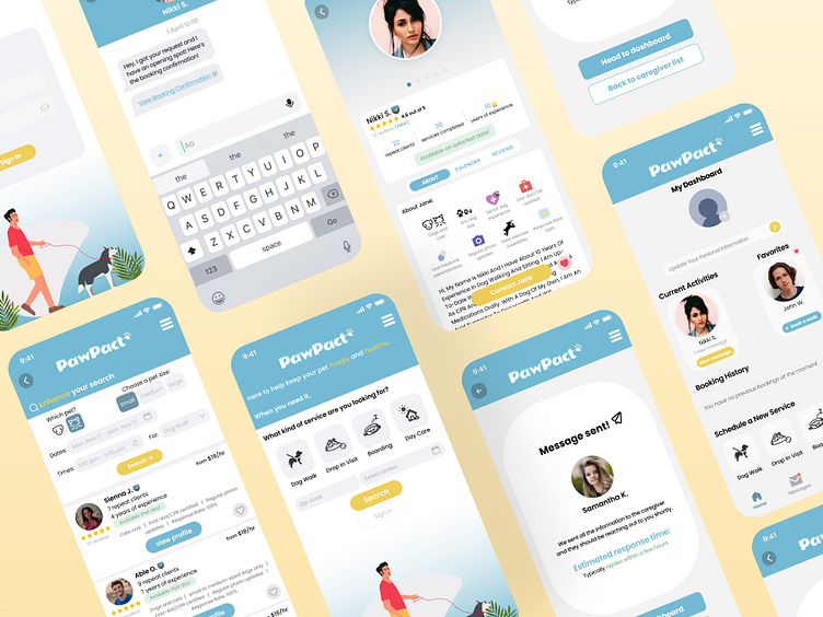
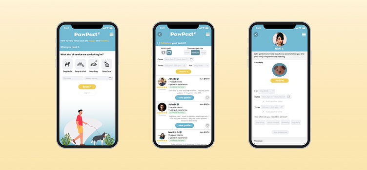
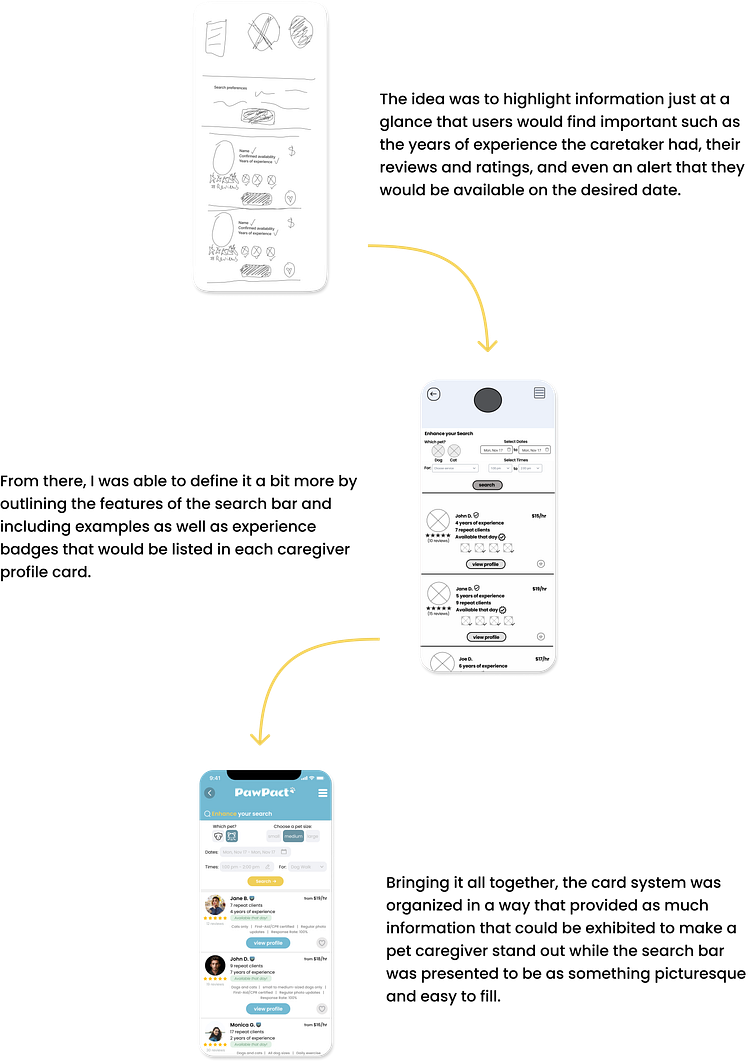
Upon reviewing the questionairres from pet owners I gathered my information from, there was a resounding need of quality assurance when it came to finding the right caretaker. Factors such as experience, consistency and expense each played a part in their decision-making process. It became apparent that in order to create an engaging app, this kind of key information should be accentuated and readily available for users to find in no effort on their part. The layout that focuses in these areas was relatively similar from it’s precursor sketch to it’s low-fidelity wireframe, but from there I sought to improve on it by including touchable icons as well as drop-down options that users could interact with in order to quickly narrow down their list and be efficient in their search time.
Getting the Flow Down
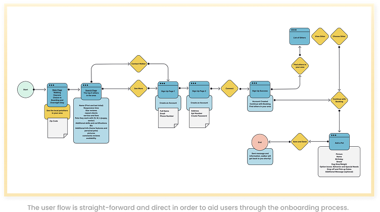
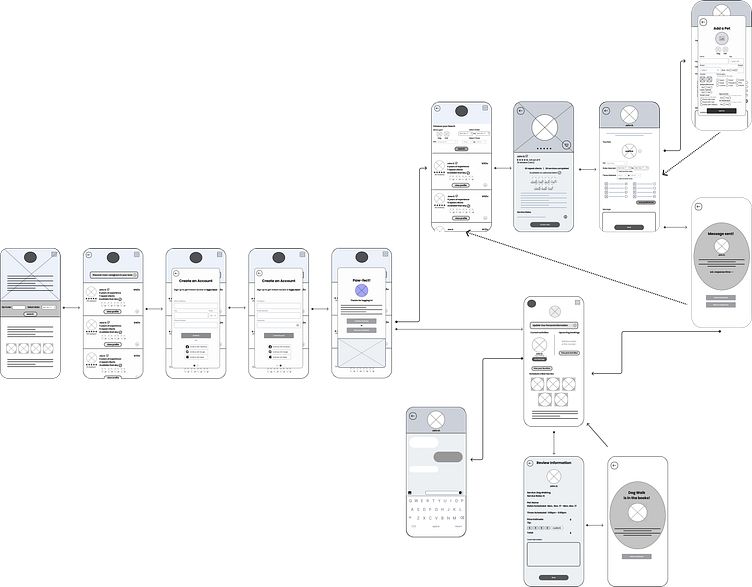
With the desire of keeping users interested and engaged in mind, the user flow of pet owners going through the onboarding process of finding and then hiring a caregiver needed to be simple as well as direct. It was important to make sure that each page had a clear call to action which would help guide the user to completion while also maintaining a friendly demeanor. As shown below, my take on it was to give users initial access to what the app has to offer. This includes searching for a service and then browsing through a handful list of caregivers with the accessibility of reading over highlighted information on their profile cards. If the user is interested in contacting a caregiver or if they wanted to discover more in their area, then they would need to sign up to continue forward. This initial onboarding method is to allow users the chance to explore the app and its functionalities before the need to disclose personal information.
Once they complete the two-page signup process, the steps continue in one direction of finding and contacting a pet caregiver. Here, I want to point out my take of when a user contacts the caregiver. Insteading of having the user add their pet at the beginning during the sign-up stage, I wanted to give them the option of post-poning it until they were ready to book a service. Following through with the idea of keeping users engaged, I thought it best not to disrupt their center of attention in searching for a pet caregiver. Once they did find one, the flow finishes off by having all the information on one page that would be sent to the pet caregiver. The idea behind this was to keep the flow going in one steady motion.
Constructing the Framework: Wireframes
Now that I had the plan mapped out, I started going over several ideas on how to construct the layouts of each page. I focused my attention on the opening page as I was thinking along the lines that first impressions mattered, and if I wanted to attract users to the app initially it was best I consider how I was going to arrange its components. After switching things around in my sketches a few times via Figjam, I ended up leaning towards the style of using various kinds of visuals that I hoped would connect or capture the attention of users in some way. Once I was happy with it, I then took the time to sketch out the rest of the flow.
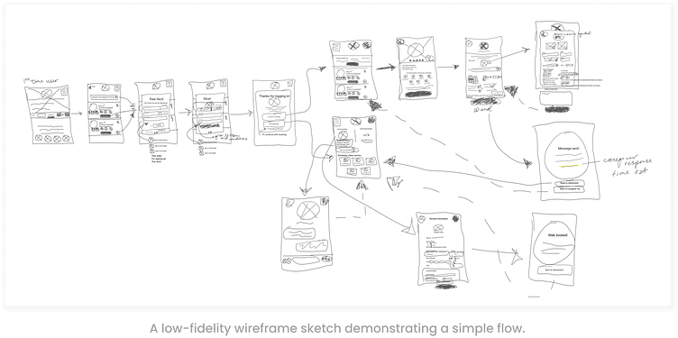
Now that I had a better picture of the look I was going for, I went back and built on to it the proper elements that make up a typical wireframe:
The Design Style
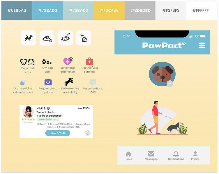
Figuring out the aesthetic components of the app was challenging to think about. I wanted the app to give off an impression of friendliness and that was something that had an atmosphere of happiness and good energy. Going back and forth on the color scheme, I eventually found and settled on an aquatic-type of blue balanced with grey, with a summery yellow tone being the call to action. Other shades of blue and grey also became necessary in order to make certain parts of the app responsive such as clicking on icons.
Regarding icons, I wanted the style to be cute and natural. I was able to find my main ones - the type of service options buttons - on the plugin, iconscout, and found that some were better off combined together.
The name of the app, PawPact, and its logo style I came up with paralleled with the goal I was going for. It has an underlying understanding of trust between a pet owner and their search for a caregiver who would deliver the quality of service that the pet needs. It could also be seen as a sign of commitment between pet owner and pet in making sure they would always be taken care of.
For the font style, I used two different types. The logo’s font was in the style of Rammetto One as I liked it’s bubbly quality while the rest of the text was in Poppins.
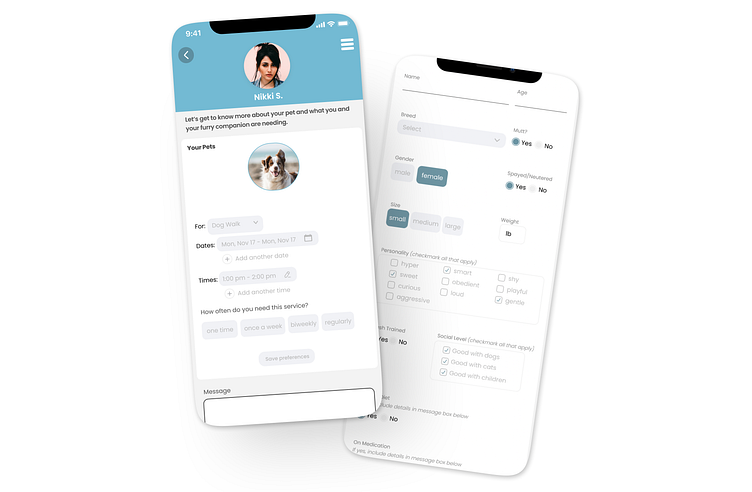
I made frequent use of radio buttons and checkboxes on the adding a pet page which contributed in keeping the attention of users as well as the flow. The placement and design of them were in hopes of speeding up the process in filling out the information. Aside from that, they played out to be nice additions in keeping to the color scheme.
The Final Product
Overall, the outcome from my efforts resulted in a pleasant-looking app that has an interesting user interface with a color scheme that brings a sense of calmness when going through the onboarding process. The flow from page to page in the new user onboarding process is set out in a way to make it advantageous for users to see what the app has to offer before they would need to commit to it. And finally, the options in filling out the information in the relevant pages are responsive and efficient in quickly aiding the user along so that they can move on to the next important task in their personal busy schedule.
Takeaways
Each step in the design process in conceptualizing and constructing the app had its strengths and challenges. And what I felt was the most rewarding as well as something that I could improve in was being in the grand scheme of finding a solution in building trust between dog-walkiong apps and the users who utlize their services.
Aside from the opportunity in being able to design an app that would hopefully reach out to the user visually, the next step would be to go back and see in what other way can the app reach out to users and resolve their pain points, such as including knowledge that each pet caregiver has to progress in acquiring (free) certifications in pet care education in order to progress on and gain more clients.
Overall, this project was fun as well as rewarding in developing my skills in product design.