#7 Shanda Maksym | UX/UI Designer | Interface for Day Zero
Test task completed — April 22, 2022
Contact — @wwweb_M (telegram)
Portfolio — https://dribbble.com/wwwebmax . https://www.behance.net/shandamaxiee83
Our comment:
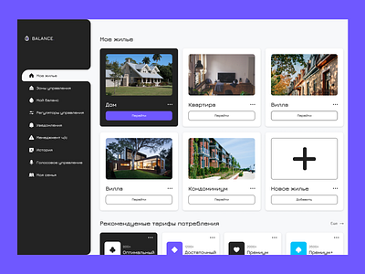
I liked how the designer worked on the structure of the pages and individual ideas, such as the “consumption program.” The color palette is calm and non-intrusive. As for the UI part of the part:
1 - There are problems with visual accents. For example, the menu and the program block take all the attention on my balance page. There are no elements inside the page that would balance this.
2 - Individual interface elements like graphics are not consistent. The lines and rounding are of different thicknesses.
3 - Levels of typography are not worked out. Identical titles make the interface not readable.


