#6 Kovalenko Marharyta | UX/UI Designer | Interface for sport
Test task completed — March 18, 2022
Contact — @mrgrtm (telegram)
Portfolio — https://dribbble.com/messwithhead . https://www.behance.net/marharytakovalenko
Our comment:
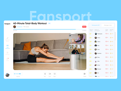
General impression:
The interface is faded; it does not convey the atmosphere of sports and dynamics.
Contrasts/Accents are poorly crafted. There is not enough contrast given in individual elements. For example, the designer has significantly contrasted the Live broadcast element, but the remaining time until the end of the workout is not visible at all (especially if you consider that they are playing sports at a distance from the monitor). Also, the icon and rating number are hard to read on a gray background. But it's good that there is a good emphasis on video broadcasting.
Spacing/balance of elements:
All the elements are scattered on the leader board, and there is no visual reference because of the large and identical spacings. The balance between the heart rate icon and the statistics itself is incorrect; the icon is heavier and draws more attention, although the statistics themselves are more important. Typography:
The font map is poorly developed, one font level is used almost everywhere. In addition, the thin and gray font in the menu is hard to read.
Iconography:
It's good that they are all in the same linear style, but it's designed in different degrees of detail and different line weights.
