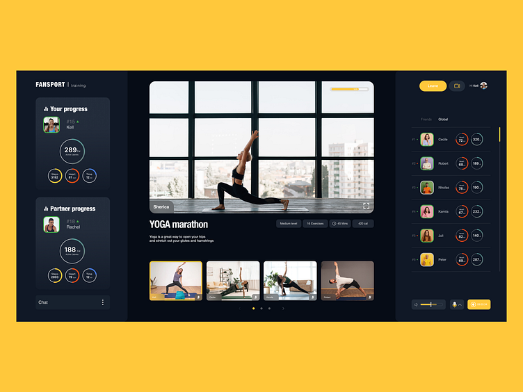
#5 Kaidash Juli | UX/UI Designer | Interface for sport
Test task completed — March 21, 2022
Contact — @julikaidash (telegram)
Portfolio — https://www.behance.net/julikaidash
Our comment:
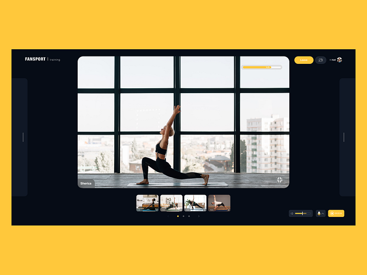
General impression: I like the dark background, the video stands out well against its background, and the colors contrast. But in general, the interface does not look clean due to different spacings and elements placement. Contrasts/Accents: Too many bright-colored elements scatter attention and do not make it possible to read data well. Progress percentages and broadcast time are not readable.
Functionality: The video and broadcast controls are scattered across the screen. There is no visible connection.
Spacing/Balance elements: The alignment of many elements within their boxes is not uniform. There is no balance in individual elements, such as profile photo and name.
Typography: The biggest problem is with text size. It is challenging to read statistics, one of the main functionalities.
