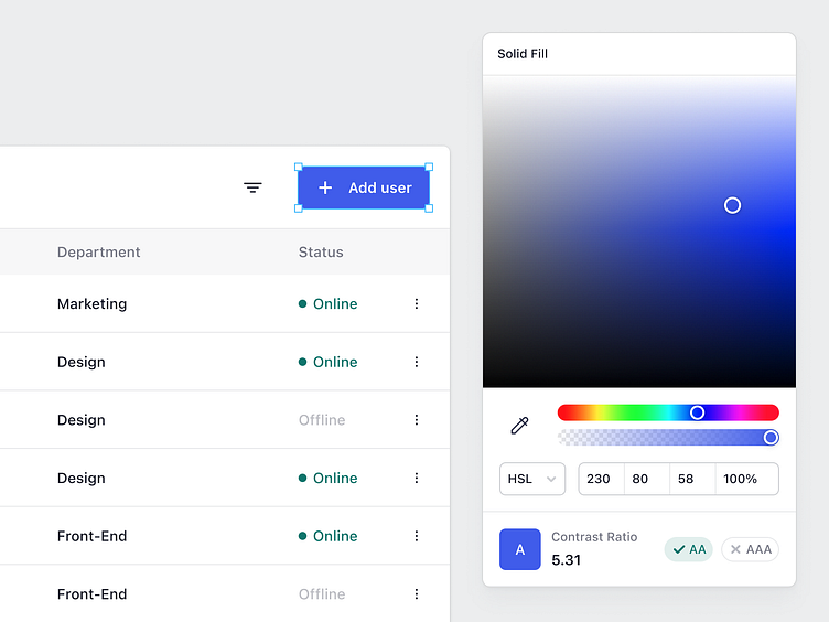
Color Picker with Contrast Ratio
As the Semiflat family grows we’ve started focusing more on fun activities and challenges that can bring everyone on our 100% remote team together. That’s how the idea of our first hackathon was born. We’ve started with a simple challenge “think of a way to improve an interface you use in your work”.
Today I’m sharing a UI of a color picker with contrast validation. The idea is to give the designer live feedback as they’re playing around with a color picker to instantly know which color combinations do and don’t pass the accessibility requirements.
______
Follow Semiflat Studio and stay tuned for more updates 😄 Don't forget to drop a ❤️ if you like it! Does your SaaS app need a fresh design?
📬 We're available for new projects. Contact us at hello@semiflat.studio
