PetCare: Product Design
Overview
Background
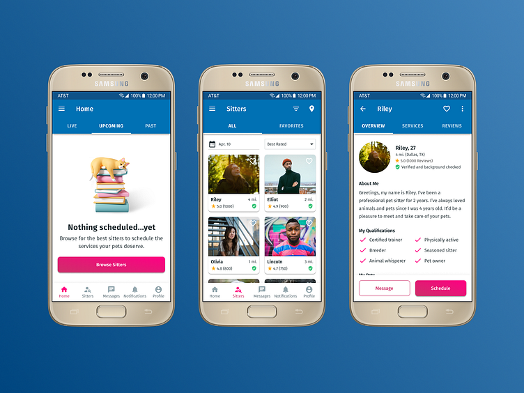
PetCare is a pet service app for pet owners to find sitters to take care of their pets.
Problem
Pet owners sometimes need help caring for their pets. The challenge was to create a service to connect pet owners with pet sitters. It was also important to consider how to help pet owners trust that their pets are in safe hands.
Role
I was the sole designer who executed an end-to-end design process:
User interviews + Market Research
Persona + User Flow
Wireframes
Visual Design
Design System
Prototype + Usability Testing
Solution
An all-in-one pet care service mobile app with a simple 4 step onboarding process.
Here are few usability testing metrics from 3 total participants:
8.5/10 average for overall user experience
9.3/10 average for visual and branding
9.0/10 average for trustworthiness and safety
Research
Interviews
I remotely interviewed 3 pet owners with four of the same questions:
Do you ever ask friends or use service for pet sitting? Why? How often?
What do you like/dislike about the service?
Are there any services or features missing?
What are the most important things you look for in a pet sitter?
Their answers varied due to experience, but few key insights were:
2 interviewees wanted to see their pets on camera during real time
3 interviewees look for reviews
2 interviewees said price is important, but would pay more if service is great
Competitor Analysis
I analyzed and compared direct and indirect competitors. Key insights include:
4 of the 5 apps offer multiple services to choose from
3 of the 5 apps don't have an option to sort profiles
2 of the 5 apps use GPS to track walks
Define
Persona
User Flow
Ideation
Wireframes
Below is Version 1:
User can login or sign up
4 steps to onboard
Empty state occurs since there are no appointments yet
Below is Version 2:
User must upload multiple photos to verify self and their pet(s)
I changed the stepper UI to reflect Material Design more accurately
Design
Moodboard
To explore branding, I created a quick moodboard:
There were 2 opposite directions to consider
Casual | Simple | Friendly | Affordable
Formal | Ornate | Serious | Luxurious
The former was more suitable
Color Palette
I used Material Palette plugin in Figma to help create my color palette:
Blue is the primary color
Pink is the secondary color
Different tints and shades help with variation and accessibility
Visual Design
UI Theme: Material Design 2
Font: Fira Sans and Fira Sans Extra Condense
Colors: Blue(primary), Pink(secondary), and neutrals
Icons: Material Design and Iconify
Illustrations: Icons8
Images: Unsplash
Usability Testing
Goals
I remotely tested with 3 participants to gauge the following:
Task completion
Pain points or obstacles
User experience
UI/Branding attraction
Trust/safety impression
Metrics
Once again, here are few usability testing metrics as a result:
8.5/10 average for overall user experience
9.3/10 average for visual and branding
9.0/10 average for trustworthiness and safety
Findings
Here are a few key insights:
Participant A expected to see a welcome/confirmation page after onboarding
Participant B was uneasy with adding payment before finding a sitter
Participant C thought editing sitter preferences in onboarding isn't necessary
Takeaways
Based on my findings, here are my design iterations for V2:
I added a welcome/confirmation page after onboarding was completed
I made adding payment optional during onboarding
I enabled sitter preferences page to be continued without being edited


