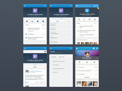
Salesforce1 - detail pages
Some of the early explorations for how the Salesforce1 contact screens would eventually look. You may notice that a lot of the screens alternate between warm/cold grey tones, which was one of the visual design nitpicks we worked on at this stage.
Worked on the beginning of 2013 at Salesforce.
More by Grant Anderson View profile
Like

