CalendarApp
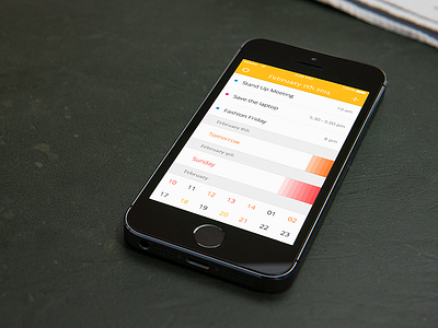
In this latest iteration, which is still in a very early stage somewhere between wireframe and design, I tried to combine both the monthly overview and the list of dates in one single screen.
The dates added to the current day are displayed as list items on top of the screen, whereas the next two days are interactive and will unfold either on tap or while scrolling. The colored header and the colored bars to the right are indicators for how many appointments have been added.
In addition to the three day forecast there's an endless list of monthly overviews. Tapping on a specific day in this list will unfold or collapse the dates.
After more then five design iterations over more then two years and lots of changes and adjustments I'm kind of feeling that this finally might be the calendar app I want to use.
Currently in development...

