Ruff: A Dog Walking App
Overview
The brief I was given was to create a service that connects dog owners
with dog walkers. I went into the project knowing that dog owners sometimes
need help caring for and walking their dogs. A major consideration was trustworthiness. It was important to figure out how I can help dog owners
trust that their dogs are in safe hands.
User Research
I was able to conduct one in-person user interview with a dog owner that had experience in the past with a dog walking service.
It was apparent that trust and accountability were big considerations for her. She had a positive experience with one previous dog walking service and a negative experience with another. She would rather leave her dog with a friend or family member, someone who knows her dog and his needs. Some features that helped build trust included a doggy dating profile and places for dog walkers to leave notes to dog owners. The features she liked to see in the future included easy ways to communicate with dog walkers that aren't separate from the profile view and ways for dog walkers to check for understanding of her and her dog's needs.
"I liked making a dating profile for Tiger. All of his info was
in one place."
Competitive Analysis
Taking the information from the user interview into account, I started looking at other dog walking services. I began with the bigger, more popular services Wag and Rover, but I also looked at a smaller service local to New York City residents called Mobile Mutts. It was interesting to see the similarities and differences of each one as well as places where each might be improved on. Below is a closer look at what I found while looking at Mobile Mutts' desktop website.
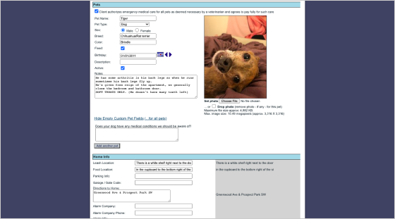
Mobile Mutts
Landing page looks sleek and modern with a full bleed looping video that draws the user’s eye in.
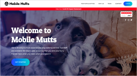
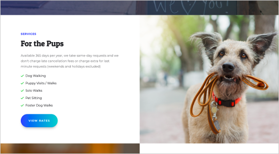
As you scroll down the page, there are a lot of details about the types of services they provide with nice microcopy that speaks to pet owners.
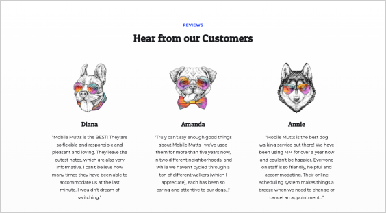
There are testimonials from happy customers as you scroll to the bottom of the page paired with cute illustrations of dogs. This helps create a sense of security and trust with the brand/service.
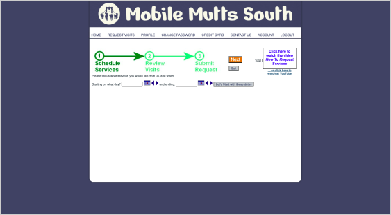
The actual portal looks outdated and could use a facelift, but the basic function of scheduling a dog walk is easy to do.
They have a nice feature that allows you to create a profile for your dog and a space for notes you can leave for dog walkers to review before they show up to walk your dog.
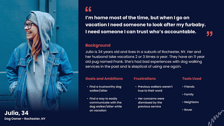
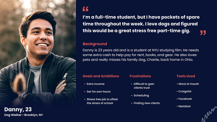
Personas
Using the information from the user interview and the competitive analysis, I was able to pull together two user personas. The first focuses on the dog owner while the second focuses on the dog walker.
User Flow
I decided to focus on the onboarding flow and the scheduling a walker flow which are both interconnected. Looking back at the competitive analysis, I liked the simplicity of Rover, but it was missing the dog profile from Wag. I tried to include the profile without making the flow too complicated. Also, I noticed both services are missing the option to provide a solo walk or a group walk which I thought was important to add. You can take a look at the user flow on Figma here.
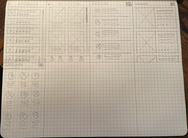
Sketches
I did a quick crazy 8's exercise to get the ideas flowing and get out quickly some thoughts I was having since the beginning of the project. I took some of these ideas and started fleshing them out as early wireframes.
Wireframes
I did a few iterations of wireframes looking for the page structure that fit best with the research I had gathered.
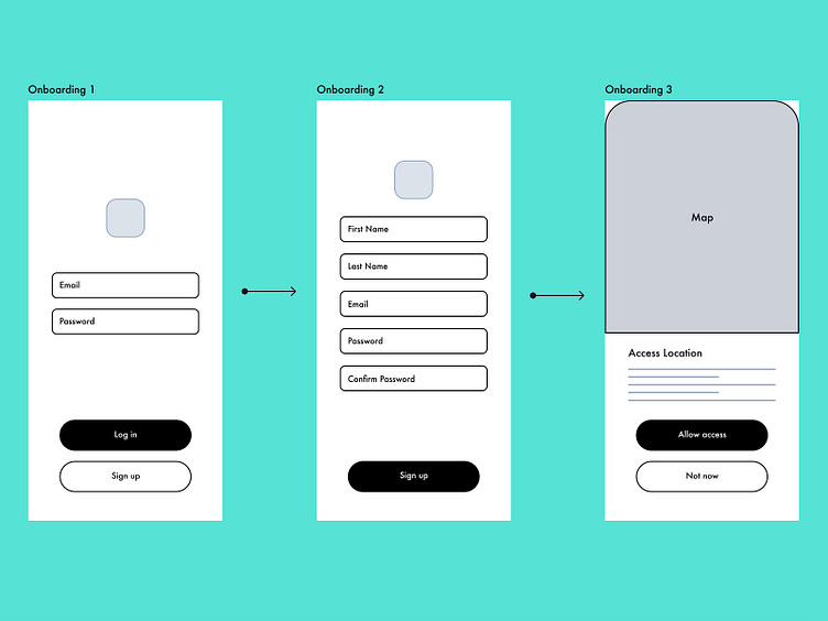
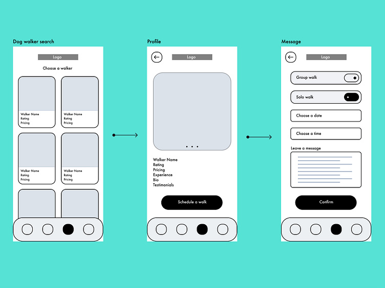
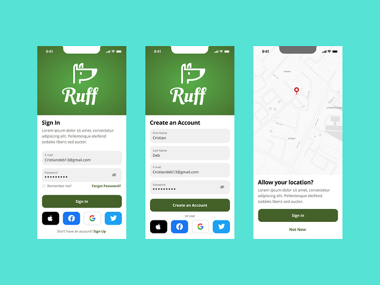
Version 1
The Log in screen leads to a signup page if you don’t have an account. Once you sign up you allow access to your location. After that you can scroll through and select a dog walker. From there, you are taken to the profile page where you
can see information on the walker like their customer rating, pricing, experience, testimonials, etc. After clicking schedule a walk you’re taken to a page where
you can select if this is a group or solo walk then pick a date/time and confirm the walk.
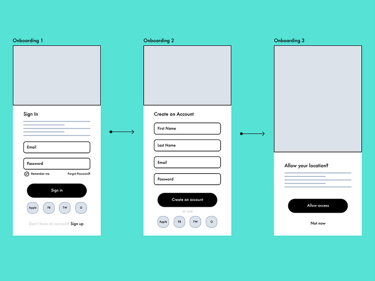
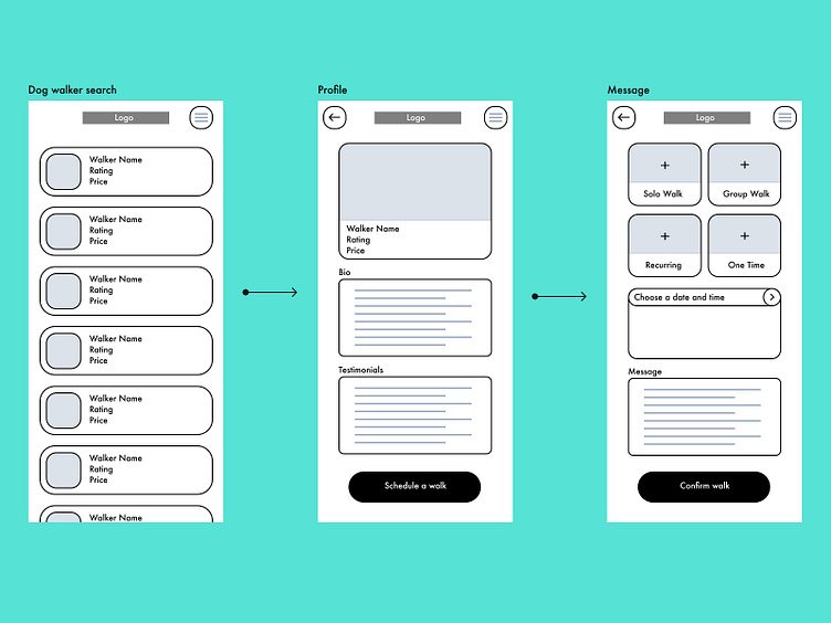
Version 2
In this version, I added more details to each screen and provided the user with more options. Also, I tried to be more image focused, especially in the onboarding section. Maybe having photos or illustrations will help the app seem more legitimate and trustworthy.
Mood Board
I spent some time looking for inspiration online that sparked more ideas. I knew
I might want to try green as a primary color in the color palette, so I looked for
a lot of different examples of apps using green in their flows. Also, I took a look
at pet related apps and all of the different ways others were solving visually for
similar problems.
Visual Designs
I picked colors, icons, and typefaces that fit the brand while being accessible at the same time. I followed a four-column grid and tried to be consistent when styling each component. I tried to keep the buttons, the rounded corners, and strokes the same across the screens.
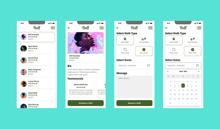
I updated the third screen based off of a suggestion I was given to separate Walk Type from Walk Frequency. The way I had it originally was a little misleading. It's meant to be a binary function for each, not a place to click every option.

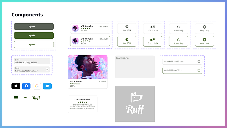
Here's the component library I used for the designs and the prototype.
Prototype & Testing
I was able to conduct one usability test on a clickable prototype with one participant. The prototype was simple, only testing the onboarding flow and the main searching for a dog walker flow. The important finding here was to include more photos under the dog walker profile, especially of the walker with dogs. Also, there was feedback about making a dashboard screen for the user before jumping into finding a dog walker. Something that included a history of walks, who the user booked for walks before, what the rating was for the walkers I've used before, to see if there are any current recurring walks, and a place to see when the user's next scheduled walk is.
If I were to test with more users, I would look to change the way the dog walker's profile is displayed. I would add a slideshow that allows a user to look through the dog walker's photos. The dashboard idea would be a good idea to include as well. I would test a simplified version as well as a more feature rich version to see which one resonates more with users.
Take a look at the prototype below and/or try it for yourself.
Outcome/Results
This was a great learning experience about how to create trust in an app/service. It was an exercise in empathy in a way. I found the features that added the most trust were the rating system on dog walkers and displaying photos to show the connection walkers have with the dogs they're entrusted with.