goodboi: a dog-walking app case study
Tools: Figma | Research: Google Forms | Duration: March-May 2022
One of the most stressful things you can experience as a dog owner is finding someone trustworthy to walk and care for your pet.
Sorting through all the walkers in your area takes time. Entrusting your pet to a complete stranger feels like a risky gamble. Friends and family are ideal, but they're not always free when you need them.
goodboi aims to improve the dog walker search experience by connecting dog owners to walkers who are friends of a friend. By integrating your Facebook friends list, you can rest assured that your dog is in safe and familiar hands.
The Problem: Trusting Strangers
Finding someone trustworthy to walk and care for your dog can be difficult through an app. Much like finding a babysitter, trust is hard to come by and maintain – especially when it comes to someone special to you.
Current dog walking apps like Rover, Wag!, and Barkly allow walkers to take verification tests and display badges on their profiles to help signal trust.
But are profile badges enough?
What other trust signals can help dog owners with the search process? What hesitations may dog owners have and need to overcome in order to trust a stranger?
To gain insight into a dog owner’s thought process of searching and hiring a walker, I sent out surveys to 10 of my dog-owning friends.
Below are some of my findings:
The Solution: Trusting A Friend of a Friend
Taking in my users' feedback, I learned that dog owners sought out people they had a pre-existing relationship with first, such as friends and family. If they were to look for a dog walker, trustworthiness and experience with their specific dog were high priorities. And apps were only used as a last resort – even then, the search experience felt overwhelming and/or risky.
With this, I saw that relationship proximity was the greatest and unspoken trust signal.
If family wasn’t available, then it was friends. If friends weren’t available, then it was neighbors. If neighbors weren’t available, then it was services that neighbors might have used. And if those weren’t available, then it was an app.
So how could this be conveyed in my own app?
My primary objective was to convey relationship proximity by connecting dog owners to walkers whom they have shared Facebook connections with. The goal is to alleviate the feeling of risk and concern when using an app.
My secondary objective was to make the search experience easier and less overwhelming. The goal here is to improve the experience so users are able to book quickly with walkers they were already familiar with.
Success would be measured by increase in number of new users and repeat bookings as well as a decrease in negative sentiment towards dog walking apps.
Research and Analysis
After my user research, I began performing competitive analyses and tried to find if my user pain points were being answered by current industry leaders.
Some things I compared were:
Depth of detail in walker profiles
Ease and ability to book a previously used walker
Depth of walker profile verification
I also compared the overall user experience as a first-time user to see how quickly and easily I could find a prospective walker and book a walk.
With Rover, I liked how walker profiles had a great depth of information like experience, home situation, additional skills, and information on their own pets. This helped me understand the walker as a person more. You can look through walkers right off the bat without making an account and direct message them for a meetup. However, I found the large database overwhelming and the filtering system tedious since I had to keep checking the boxes for my pet information.
With Wag, I liked that you could skip some parts of the onboarding process. I disliked how gated the entire experience was and that you had to create a profile first before searching through walkers. I found this very frustrating as someone who was just trying to browse.
From these findings, I decided to implement these features into my app:
Ability to explore walkers without creating a complete profile and ability to skip onboarding
Ability to “just book” along with a messaging function to ask for a meetup
Ability to see previous and favorite walkers
Priority listing of walkers with the most mutual Facebook connections
Automatic walker filtering based on specific pet criteria (breed, age, height, weight, temperament, etc.)
Below is my proposed user flow:
The Wireframes
I had sketched out a couple of concepts for each frame on paper (unfortunately, I think some paper gnomes seem to have stolen said paper so I have no image to include). After some rapid wireframing, I selected some frames I was happy with and started building them on Figma.
When building the cards, I prioritized the number of shared connections, number of walks completed, and ratings with reviews to build trust.
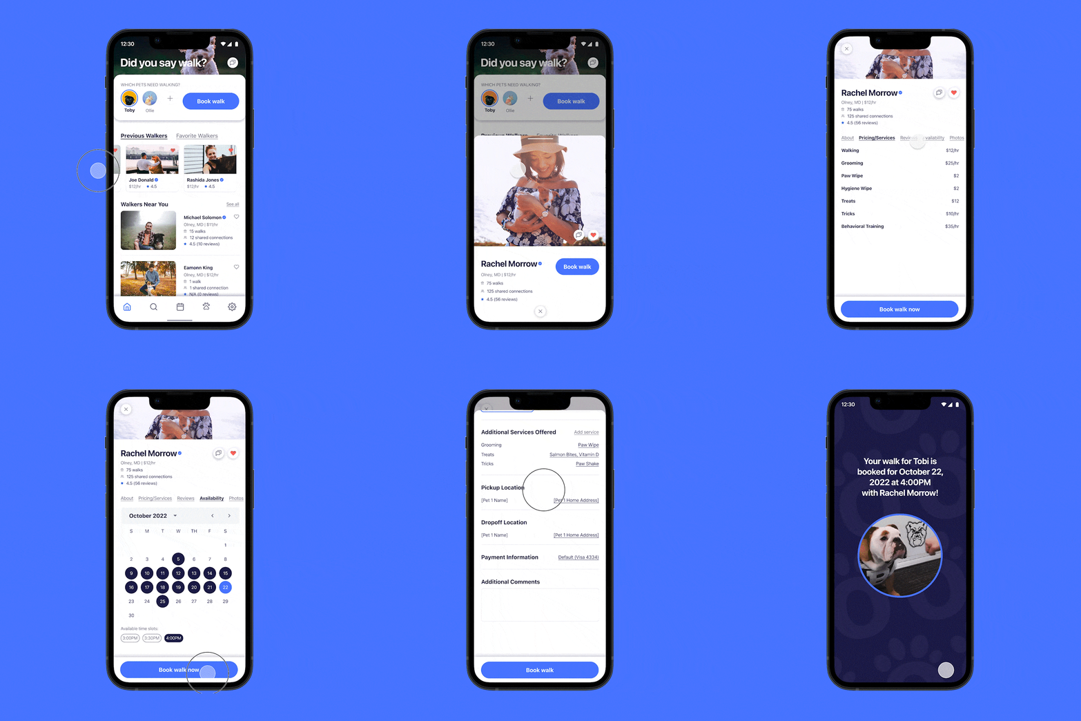
Most of the frames have a “quick book” function so that users can easily book a walk anywhere on the app.
Users also have the ability to select multiple pets at a time, which is something I didn’t really see in competitor apps.
The filters would apply the parameters of selected pets (like weight, height, age, breed) so that the user wouldn’t have to sort through walkers that weren’t experienced with their dog.
Below is my wireframe flow:
The Visual Design
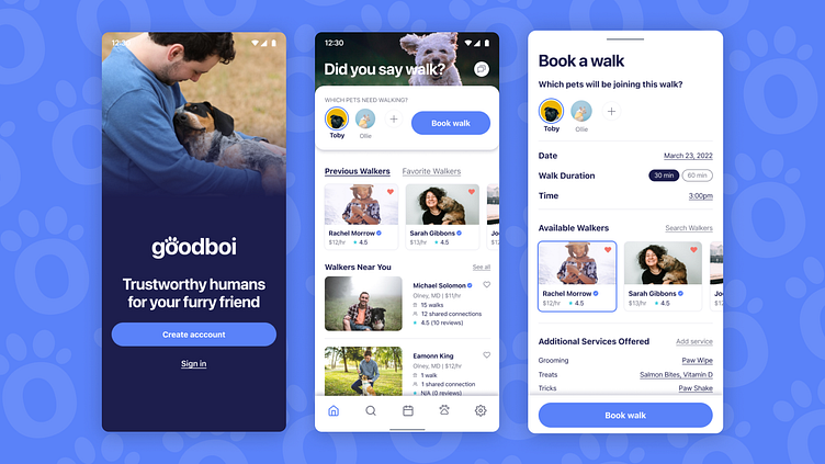
I called my app goodboi and established some bright brand colors and simple serif fonts. While applying the visual design, I also edited the layout of some frames.
I had iterated the dashboard and walker listings a couple times before landing on the versions listed below. The dash and walker listings had very similar elements, so I combined them to be mostly in the dashboard and simplified the walker listings.
Walkers are now listed by previously used first and show less profile data since the user has used them before. After that would be a list of recommended walkers, displaying walkers with the most shared social media connections first.
Using the 60-30-10 rule, my goal was to make the app as simple as possible with color only highlighting important CTAs instead of overwhelming the user with too many variables.
The images used in these high fidelity mockups are supposed to mimic user-generated photos where dog owners can submit photos of their pets, which could potentially show up on the onboarding screens. This would add to the community-building aspect of goodboi.
Takeaways
One of the greatest takeaways from this project was utilizing user search and competitive analysis to create a product that would differentiate itself from the market. Product design is all about creating solutions for problems, not just creating pretty apps. Each element on an app must serve a purpose, and its purpose must be clear to the users.
I learned a ton about interaction design, iterating until the layouts and flows made sense, and had a blast trying to make this app responsive with auto layout and pixel perfect for developer handoff.
✅ I'm open to work! Let's connect on LinkedIn


