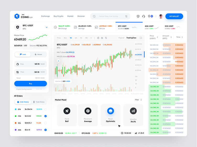
Exchange website - Light mode 🔥
Hello!
Greetings, friends! I wish you a pleasant day! ❤️
Today, I'm going to show you one of the Exchange website's pages! Personally, I like it a lot. I tried to make it as contemporary as possible. Although there is a lot of buzz about cryptocurrency these days, and everyone is buying and selling it, most exchanges do not have a nice user experience, and what good would it be if exchanges thought about redesigning their websites? It will be more profitable for them, as well as more convenient for their website visitors!
Hope you liked it!
Follow me on Instagram to see more UI/UX Content.
We are available for new design project : 📩 Work With Us: Aceagency.design@gmail.com
More by Ace Agency View profile
Like

