Daily UI #004 - Calculator
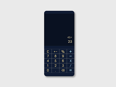
Number 4 of the Daily UI. I was inspired by a custom mechanical keyboard I saw some time ago with a midnight blue and gold color scheme. I considered a much more neutral font but in the end I felt a font with more personality made a stronger statement.
The narrow button height is to reduce the coverage a user needs to reach all of the buttons.
Another key feature that I wanted from the beginning is a large display that maintains a visible history of every entered calculation. I consider it a huge flaw in a calculator that doesn't do that because any user is prone to forgetting what they have entered and they have to start again.
Lastly, I wanted a clear button area. Some calculator designs don't include that, I appreciate that choice aesthetically but I feel there is a slight UX advantage in having a clear area around the digit, rather than only the digit which is a much smaller target area.
