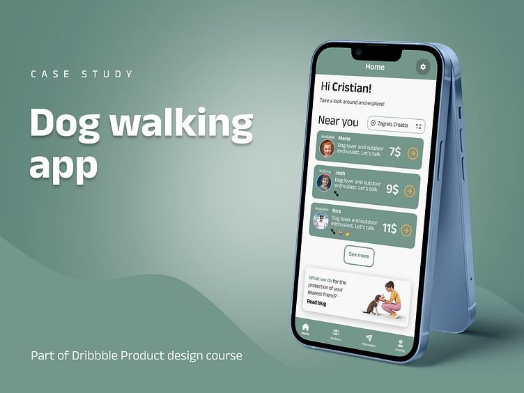
Dog walking app - case study
As a part of the Product design course by Dribbble, as a group, we were given the task of designing a product that would connect dog owners with dog walkers.
After defining the problem, we continued to work on individual designs with constant feedback from our mentor and the rest of the group.
Problem Statement
Through brainstorming, we came up with ideas for how the users are, their problems, and how to solve them for dog owners and dog walkers.
Below you can see the filtered out and complete versions of the ideas.
After coming up with various ideas for who the user is, what their problems are, and how to solve them, we filtered out the user based on Pareto principle and their issues.
The Research and users' feedback
Based on the filtered result, I approached the research phase in two directions: conduct one qualitative in-person interview and a quantitative Google form.
"I like that I can make a dog walking booking online and maybe see a walker review, but I am unsure about the legality of thoughts and how much I can trust that person."
Here are summarized data from quantitative research.
From gathered data I created user persona.
User Flow and Wireframes
The general user flow for booking a walk and wireframe is based on the given user flow.
Design
While choosing the color palette, I started with the primary green color that I extracted from the illustration. To complement that primary color, I decided on the warm yellow color that represents friendship and optimism to give the overall process a more trusty look.
What I learned
Through the research and testing phase, I found out that people generally have trust concerns, especially regarding their beloved ones, in this case, their pets.
In the testing phase, users liked the badges that show the credibility of the walker and the option to see a video introduction to get more familiar with a potential dog walker.
Any feedback is more than welcome. Thank you for taking the time to go through this case study. I hope you liked it.


