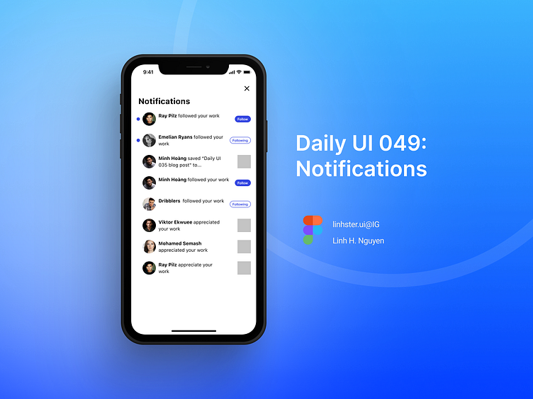
Daily UI 049: Notifications
As per my #047 post about activity feed, I intended to show it as for #049 (Notification) too. Like, one shot, 2 takes. Apparently, I’ve changed my mind after using the @behance app on iOS and there’s one thing about the notification center that I’ve wanted so bad for it to change. It is the “Follow” and “Following” buttons. The problem for me is that right now, these 2 buttons in my notifications center look kind of the same, take one quick look and I got confused everytime I was in noti center of the app. So I made this design where I made the “Following” button into secondary button, separate from looking so much like the “Follow” button. The things is I wanna know who I’ve already follow, and who’s not, all quickly so I don’t accidentally click on the “already followed” person and unfollow them by accident.In my opinion, those two should be primary and secondary buttons as you guys can see on my re-design. I’ll post Hd version on my Behance, so follow me on B, and other socials (link in bio)If you reach here, thankssss so much for reading.Interested in sharing your thoughts?
Made with Figma
Plug-in: UI Faces
Follow my Socials for more post in the future: https://linktr.ee/linhster_ng
