UX case study: Dehumidifiers: Empty Cart Solutions
About Project: eCommerce shop that sells dehumidifiers in the UK market.
Case: To take users to shop from every page on the site - In specific case to take users to shop from empty cart page.
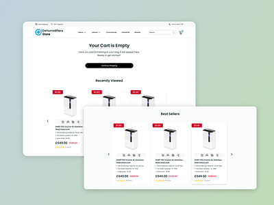
Problem: On many eCommerce sites (even famous brands shop) I noticed that the "empty cart" page is for real just an empty page! Oh yeah, in some cases there is a message "your cart is empty" :)
For me, as a design specialist, marketer its a huge UX mistake made by different professionals.
However rough it sounds, the main goal of an online shop is to make user to convert in max 3 steps.
Solution: To make our "empty cart" page look nice and be "empty, not really empty" :) I added here the products carousel section.
This is quite popular and trending solutions in UX.
1. For users who already walked through your site and viewed several products we have the "recently viewed" product section + "Best Sellers".
2. For new users, who accidently or intentivly checked their cart page we have only "Best Sellers" product section.
_ _ _ _ _ _ _ _ _ _ _ _
Contac Info: Linkedin | Facebook | Instagram | Twitter
For collaboration reach me out at victoryhovsepyan@gmail.com
