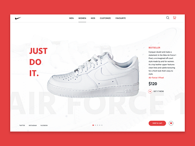
Nike Landing Page
Hey
This is an exploration for Nike’s landing page. Taking inspiration from the signature Nike Air Force 1’s, I’ve kept the colour palette mostly white with a little use of red, black and grey and the design clean and minimalistic.
Hope you like it.
More by Sanjana Gangwani View profile
Like
