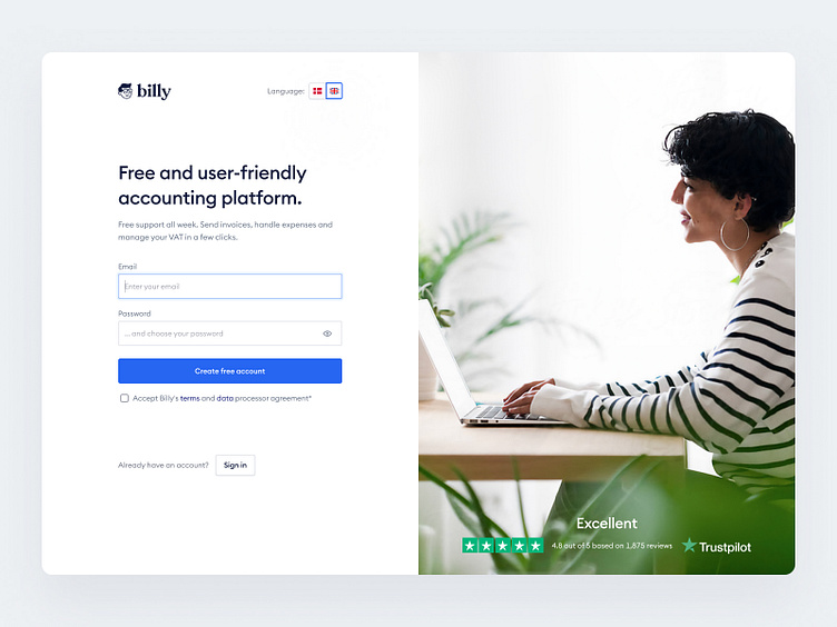
New Customer Acquisition Process (Sign Up Flow)
In this case study I focused only on a small part of the SaaS Acquisition -> Activation process which is the sign up form.
Here's some of my design decisions that ultimately affect UX and metrics.
• Autofocus on the first field (from the UX perspective it guides users to the first action required)
• Humans respond positively to seeing people, especially faces. We tend to look in the same direction as other people. In that case woman is looking at the sign up form, which we'd like users to focus on and accomplish.
• Still at this point more important is building trust, so that’s why I used the smiling woman picture instead of real-looking product screenshot (which I intentionally will use in the next step).
• Research showed that users use a lot of show/hide password feature. That’s why it’s reflected on the design too.
In one of my previous shots I showed the dashboard overview for a user, who already has used the product several times (so has provided some data that the system can work with and display the output information).
⬆️
Users should play a game with clear and transparent rulebook. So the password requirements are visible by default.
⬆️
Instead of making a separate step where we ask for name and phone number, I wanted to ask for name and business details at the same time. The action on the button is called ‘Get started’ which gives users an impression that they will be able to start using the product right away.
⬆️
This step has been vastly reduced. We ask only for the company’s name or CVR and the system would match it with record in the database.
⬆️
Alternatively, a user can choose providing the company's details manually so he gets the input fields needed to be filled in to continue.
⬆️
Users are more likely to explore the app if they're exposed to complex features later - it's a psychology principle called the progressive disclosure. A gradual learning curve decreases the bounce rate and increases the retention rate.
New users have a specific goal in mind when they discover an app. This is the moment, when they say "Check!" and compare the status quo with the initial promises. Here we focus on two core functionalities: Invoicing and Expenses. Our role is to identify new users' hopes and pains quickly, and align the experience with their needs—not the other way around.
Thank you!
Are you interested in more content like this? Let me know in the comments!


