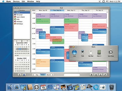
iCal + iSync (Brushed Metal)
When we first started developing the iCal calendar app, I knew it had the potential to be a game-changer.
The first thing we focused on was the people experience. We wanted to create a calendar app that was familiar and easy to use, with a clean and modern design. We also wanted to make sure it was fully integrated with other Apple products, such as the iPhone and MacBook, so people could easily access and manage their schedules on the go.
To achieve these goals, we assembled a team of two designers who were passionate about creating a top-notch calendar app. We worked closely with our research team to gather feedback and insights from real people, and used this information to inform their design decisions.
One of the key features we wanted to include was the ability to sync calendars across multiple devices. This would allow people to easily update and view their schedules on any device, without having to manually enter events or appointments. We also added the ability to invite others to events, and to set reminders for upcoming appointments.
In order to make the app as people-friendly as possible, we put a lot of thought into the layout and navigation. We wanted to make it easy for people to see their upcoming events at a glance, and to quickly add or edit events as needed. We also added customizable views, so people could view their calendars in a way that best suited their needs.
Overall, the development process for iCal was intense but rewarding. We were able to create a calendar app that exceeded people’s expectations, and that has become an integral part of their daily lives. We are proud of the work we put into iCal, and believe it is a testament to our commitment to innovation and people-centered design.
