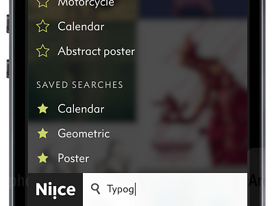
Niice iOS
Starting to flesh out some ideas for the Niice iOS app (check out the attachment for full mockups). Does this look like something that would be useful to you?
While the plan is for it to be a universal app, I'm designing for iPhone first to force myself to keep things as simple as possible.
For iPhone, I think it makes sense for the search bar to be at the bottom to make it more accessible. I don't want folks having to stretch to the top of the screen just to perform a search.
I’m also thinking of shipping the app with just search features to begin with, rather than holding it back until we get moodboards working on iOS. Does that sound like a good idea, or does it really need the collection feature to be useful?
Feedback appreciated!
More by Chris Armstrong View profile
Like

