Fixing bad UX - Delivery Confirmation


I just had to do something, please read.
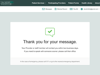
I had to send my doctor a message through my hospital's portal (the use of the world portal should have been a red flag). The interface is a mess to being with. A navigation that is too wide for the parent container, and a "home" dropdown that repeats the entire navigation as children.
Anyway, so I write the message and hit send and am just dumbfounded by the screen I am given. There are several elements on the page from before the message was sent, that is only relevant to the user before it is sent. There's just so much clutter.
I just wanted to take it into Photoshop and see how much information was actually relevant. While I was there it would have been impossible to not have redone the nav ;)
Please check the attachment to see the original, offending interface.