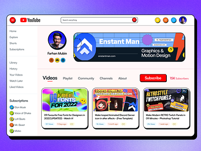
YouTube Dashboard - in Neubrutalism UI Design
Hi, Creative Brains,
I have finished doing a fun project on Neubrutalism Ui design. Was following this style for few months but after getting inspired by Malewicz's youtube video.
I decided to design the Current YouTube Dashboard UI to the Neubrutalism design. Also I have changed the layout of difrenet element on the dashboard UI design. So I can make it super clean.
(^▽^) Get the Free Neubrutalism Icons here
This was a fun project and I dint care about readability and color choices. I have just put my wireframe (hand sketched) into something special that no one will love to see on YouTube Dashboard. Like what happen if YouTube implement the Neubrutalism in there UI/UX (xD)
💬 Any suggestions on this Neubrutalism YouTube Dasboard UI redesign are extremely useful.
💙 Press "L" if you loved it :)
😉 Currently Available for:
🔥 UX/UI Design
✅ Webflow Development
✅ Wordpress Website
✅ Branding Projects
Want to Get started with your next big project?
(◕‿◕) Reach out to me here: hello@mubin.design
Website: Mubin.Design
Thank you for stopping by and seeing my post.
NOTE: I have to upload the design once again because the previous one was messed up shadow.


