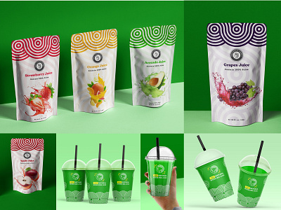
Penny Juice Logo Re-Design
Two months ago I worked on a logo redesign for the previous logo mark. I always enjoy working on these redesign in my free time to stretch my creative muscles.
I really liked the simplicity of this mark, which also showing great depth and color harmony. I would love to hear your thoughts and what you think of Gmail's current logo mark? Not really saying my concept is better, but more like an alternative idea which in my opinion could work really well too.
Feel free to rebound and share your redesign concept, excited to see more ideas.
More by Har Ram Mohammad Singh View profile
Like
