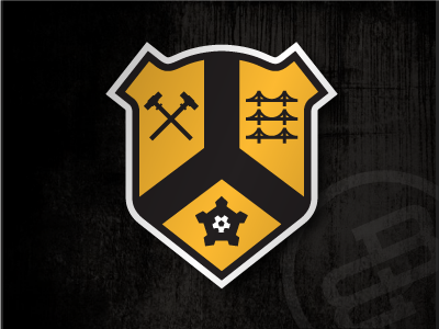
City Badge, Version 3....
So here's the next rendition of this thing...went back and changed a few things. Rounded top went bye-bye; wasn't liking it. Changed up the top corners to fall more in line with the (very hidden) shapes/lines/angles of the pentagon form from which this entire thing is based (check out Fort Pitt; that's where that idea came from). Also added an anvil under the crossed sledgehammers to a/ fill in some much-needed space and to better drive home the whole steel industry heritage that part of the badge is supposed to tell. Also made some slight edits to the "three sisters" a.k.a. the north shore bridges.
Still feel like this thing needs something more--or maybe it needs something less. I don't really feel it's quite where it needs to me...maybe it's the line weights or something? What y'all think?? :-/