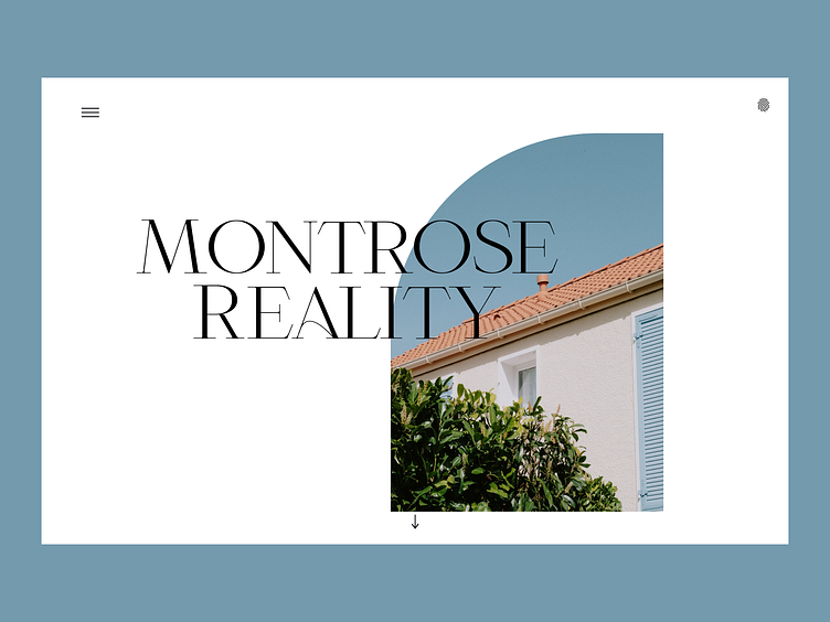
Case Study: Montrose Reality
Landing Page for an elevated, modern reality firm. Emphasizing minimal design through clean lines, unique typography, and arches as a nod to architecture. Using simple iconography and details like the fingerprint icon to indicate log on and seamless ux to show modern.
More by Lelaina View profile
Like
