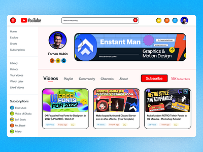
YouTube Dashboard - in Neubrutalism UI Design
Hi, Creative Brains,
I have finished doing a fun project on Neubrutalism Ui design. Was following this style for few months but after getting inspired by Malewicz's youtube video.
I decided to design the Current YouTube Dashboard UI to the Neubrutalism design. Also I have changed the layout of difrenet element on the dashboard UI design. So I can make it super clean.
This was a fun project and I dint care about readablity and color choices. I have justput my wireframe (hand sketched) into something special that no one will love to see on YouTube Dashboard. Like what happen if YouTube implement the Neubrutalism in there UI/UX (xD)
💬 Any suggestions on this Neubrutalism YouTube Dasboard UI redesign are extremely useful.
💙 Press "L" if you loved it :)
😉 Currently Available for:
🔥 UX/UI Design
✅ Webflow Development
✅ Wordpress Website
✅ Branding Projects
Want to Get started with your next big project?
(◕‿◕) Reach out to me here: himubin22@gmail.com
Thank you for stopping by and seeing my post.


