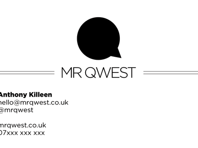
Business card v3
Ignoring everything I've done before, I've taken the header from my recent dribbbles regarding a redesign idea and applied it to the card.
A comment from Jamie Wright confirmed what I thought - that it may look pretty good on a business card.
And here we are. Again, it'll be letterpressed. Pretty happy with it.
Just wondered what your thoughts where, especially the details in the bottom left. Do they need to be more balanced or is it ok on the left?
Comments welcomed :)
More by Anthony Killeen View profile
Like
