HORIZONS Programme Logo
The "HORIZONS" Programme is an initiative sponsored by Glasgow City Council and "Young Persons Guarantee". They needed a logo to identify the programme and asked myself to come up with a proposal.
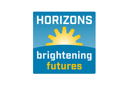
The most hopeful feeling comes to you when you gaze into the horizon at sunrise. It symbolises a new day, a new ray of hope. I created a horizon line and set a rising sun behind it to reinforce the concept of the “HORIZONS” project promise of “brightening futures” for young people.
With that sun I gave it significance by altering it to a cog/sun to remind us that this hopeful sunrise on the horizon symbolises the world of work and development of a person to be all they can be in the “HORIZONS” project. A cog in iconography has always been a symbol of working and progress, so what better idea than to combine the sun with a cog to create a suitable future horizon?
The font I have used for the legends “HORIZONS” and “brightening futures” is a legible but friendly typeface of humanist origin to welcome anyone interested or wishing to participate in the “HORIZONS” project.
I have used a colour palette of blue and yellow. The yellow is relevant to the colour of the sun, but also the warmth and hope of a bright future. The blue is for business and productivity, but a less dark blue to again remind us that the “HORIZONS” project is about helping young people into work and there development and not about making money.