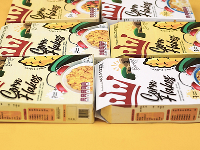
Nasco Cornflakes
To help NASCO standout from the crowd, I determined it could leverage two trends
aligned with it's heritage: the quest for simplicity and the desire to live well!
Simplified the packaging design, building on the inherent strength of the most powerful elements... Updated the distinctive Crown Logo!
The box remains Modernist & Fun... The eye-catching cereal bowl with an alarm bell, reminds us of an healthy breakfast.
Strong use of color palette potrays the fresh, natural ingredients...
These changes sure would position NASCO as a bold category leader! while reclaiming it's iconic status...
Definitely more consumers, would be able to find these delicious packs more easily!
Am sure you would want this on your table 😉
More by Samuel Tosin View profile
Like
