Fresca Materials


FRESCA
› street food › fresh food
› strategy › naming › logo › packaging
› pos › copy › print › icons › photography
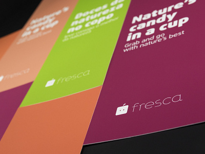
Fresca is all about providing fresh fruit to the customer, in a convenient way. Aimed on the commuting customer, it sets the goal to provide healthy and fresh street food in an “easy bite size taste”, and with a fun look.
The logo is a compromise between a cute personification of a sliced fruit where the seeds are the eyes and the word fresca (fresh). Together, through an icon and word game, they complete the expression fruta fresca (fresh fruit) in a playful, sympathetic and humanised way.