UI challenge - Day 10
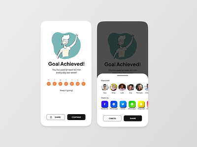
So I thought about going for something simple and trying to use a dark grey shade for CTAs. When I did the social media buttons I realised that this is something where neubrutalism could be applied but I already had the rest of the design created and didnt want to change that.
So despite the screens being a little bit of mess it actually inspired me to play with neubrutalism next time.
More by Jana Halfarova View profile
Like
