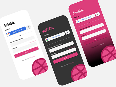
Dribbble sign-in page redesign
What would be more obvious than a UX/UI designer posting a redesign of the sign-in page to the community she_he is joining?
Usually, I'm always a dark-theme player, but designs like this make me think of how much fun it would be, to also have the option to go color-theme?
I'm super excited to finally be part of this amazing community, looking forward to sharing more of my work here.
Created with Figma.
More by silvija gregorchich View profile
Like
