Madewell Logo Refresh - Concept

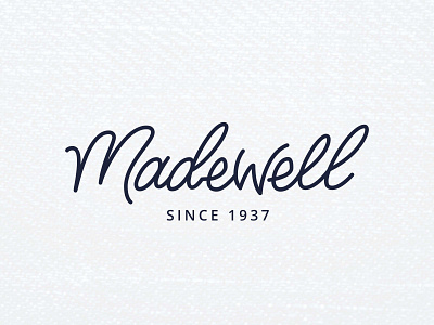


My take on the Madewell logo. I've been thinking about it for a while and the fact that they haven't refreshed their logo since their inception is really interesting to me. According to my research, the logo is actually the same one used by the founders of the then durable, work clothing focused brand in the mid 20th century. Though there's a charm in using the original logo, the company is no longer that labor focused brand anymore, so I decided to refresh it! Keeping a hand made feel, but updating it to better reflect their current customer base - 20 - 30 somethings who want comfortable clothes that are still stylish.
In this exercise, I created the main wordmark, wordmark with tags, a secondary logo and a few badges and icons and color palette.Note: this is just a concept for a Madewell brand update, it is not the official logo.