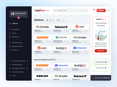
LastPass Password Manager - Dashbaord Redesign
Hi, Creative Brains,
The old Dashboard was not user-friendly. Hence I decided to redesign it and make it more user-friendly.
I have always been a fan of the LastPass password manager. I think it is one of the best password managers out there. But when I use it daily, I felt the Dashboard was quite overwhelming and boring to click on the buttons.
I wanted to redesign their Dashboard because they needed a refresh, as their competitors were doing better in terms of UX and UI.
So, I tried to make my version of the Dashboard. It was a self-assigned project, but still, I have not gone for a completely new look. I have kept the almost the same UX structure but refined the elements and gave an overall look a more Modern Look.
💬 Any suggestions on this website's Hero Section design are extremely useful.
💙 Press "L" if you loved it :)
😉 Currently Available for:
🔥 UX/UI Design
✅ Webflow Development
✅ Wordpress Website
✅ Branding Projects
Want to Get started with your next big project?
(◕‿◕) Reach out to me here: himubin22@gmail.com
Thank you for stopping by and seeing my post.


