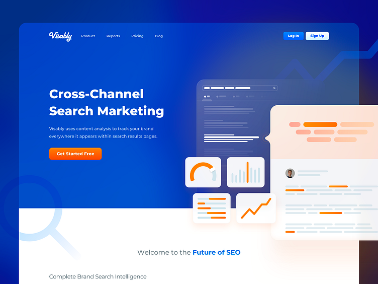
Visably Home Page
In re-designing the Visably marketing site, I wanted to make sure that visitors weren't overwhelmed with content. Rather than packing in details that would be overlooked, I simplified the sections, layout, and language used throughout.
Here's the hero section of the home page. Getting the illustration to be communicative while maintaining simplicity was a tricky process, but I'm pleased with where it landed.
More to come shortly (likely in a Dribbble case study) but until then - enjoy!
More by Max Burnside View profile
Services by Max Burnside
Like
