Notification Drop-down
Hey
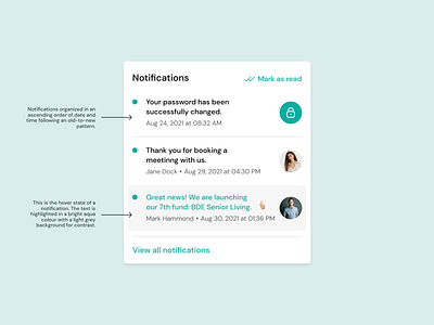
Happy to share this notification drop-down concept with you which I’ve created for a FinTech platform. The notification organization follows an old-to-new pattern. Each notification has a title with some basic information corresponding to the title below it. The hover state of a notification has a light grey background with bright aqua text for contrast and easy readability. There is a button on top of the drop-down to mark all the notifications as read and a button at the bottom to view all notifications