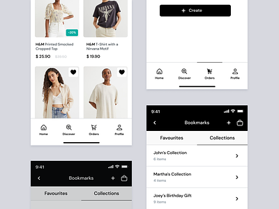
E-commerce components
Hey,
I’ve created a few components for an e-commerce platform for H&M. The components follow a design language similar to that of H&M’s with neutral colours like black, white and grey that go with the brand personality. These tones are basic, multi-usable and balancing. I’ve added jade as an accent colour to highlight the items that are on sale. The user can navigate to different pages using the navigation bar at the bottom of the screen. They also have the option to add favourites and build their collections for various occasions.
More by Sanjana Gangwani View profile
Like
