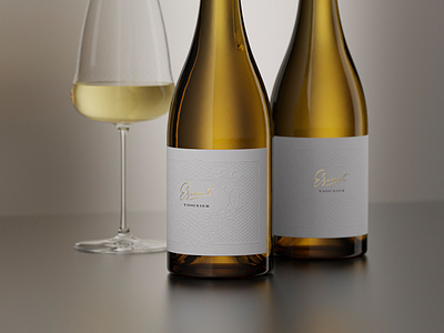
the Labelmaker: Ezimit Wines / Viognier
A Wine Label Design Where Every Detail Matters
Ezimit’s wine design is a result of my passion for calligraphy, ornaments and exquisite details. At first, I didn’t know exactly what wine label design I would do. I went through several projects that I liked, but later on, I realized that I have to look for the beauty of the finest elements. I really wanted to have a label with embossed elements, because I was tired to see that every label I came across was having only raised varnish or hot foil stamping. I needed to use some older original technology to bring character, authenticity and life to this wine label design. Here my colleagues from Dagaprint came to the rescue – their attention to details has grown to a professional religion. We chose paper with a smoother surface, on which the relief was very noticeable and at the same time very elegant and detailed. The main embossed motif is a very detailed ornamental frame, which covers almost the entire area of the label. In the center, there is an empty space where I put the name of the variety. Above it, I placed the Ezimit brand. This is a custom hand-lettered heading made by me, which we stamped with gold hot foil and embossing to stand out even more. We paid special attention to the capsule, which consists of two parts. At the bottom, it is black, branded with the Ezimit text, while the upper part is gold, and at the top, there is an embossed Ezimit brand. The bottle is very solid and at the same time extremely elegant and attractive. The completely wine label design became very stylish and classy. I did my best to create many details in the image itself and show them in the best possible way.
