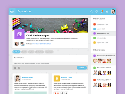
Ui Design for the Course Page
Slight redesign as we move on with the designs.
Also moved from 2 column comments to a 1 column solution since it works better on tablets.
Anyhow take a look at real pixels and share your thoughts.
Again thank you for your constant support guys :)
More by Balkan Brothers View profile
Services by Balkan Brothers
Like

