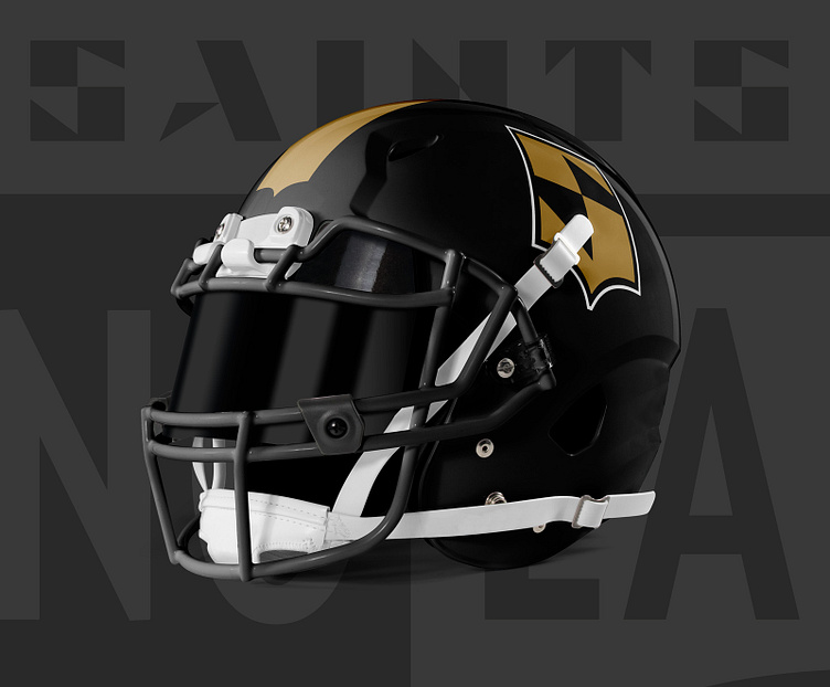
New Orleans Saints Refresh
A simple mark transforms into a whole new identity.
This project started as a primary logo competition through Super Design Bowl and I had a blast extending beyond that.
Before we get into the transformation, let’s see how it all started…
Sketches & Inspiration
My inspiration came from reviewing the Saints logo history, and the shield graphic stuck out. The team was named "Saints" due to its birthday on the Roman Catholic Church's All Saints Day. Since joining the league in 1967 the team has remained fairly consistent with its logos and colors.
Logo Progression
The shield stuck for a couple reasons: one it was part of the logo history, and two Saints are commonly memorialized on necklaces in a shield shape. After getting enough sketch work in, I got to the computer and started to bring it to life.
Primary and Secondary Logos
Color & Type
I kept the team identity colors, but in application it is flipped to feature more black. Secondary fonts and custom typography were paired for a unique look.
Custom Logotype
Application & Apparel & Extension
Custom numbers!
With this being a football team rebrand I had to create a custom number set. There are two styles: a stalky version for the shoulder, and a skinny version for the front/back of the jersey.
About the project and voting outcome...
Let's design together.
Get in touch on your next project!
Email: jgrimesdesign@gmail.com
Twitter: @J7Grimes


