Logo Design - Nito Design Studio
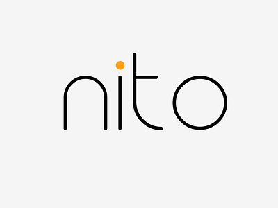
Logo Design for my design studio - Nito Design.
Key aspects:
Thin and simple typography - Give aspects of modernism and professionality.
No Icon - Distinguishes it from larger consumer brands.
Curved rounded edges - Feel of transparency and approachability.
Black primary colour - modern and intelligent feel.
Orange secondary colour - creates a contrast feel of creativity and excitement.
At Nito our message to clients is transparency - We fully prioritise user needs and the journey. This is well reflected in the logo design.
Leave your feedback! What would you do differently? What does this logo mean to you when you see it?
----
Got a project that needs tackling? Work with me or my design studio.
Personal: tjmartlew@gmail.com
Studio: contact@nitodesign.co.uk
Co-Founder and Lead Designer at Nito Design: https://www.nitodesign.co.uk/
See more portfolio work on Instagram.
OR get in contact via LinkedIn / WhatsApp: +44 7432250303
