Selah typography

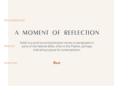

We selected Metropol 95 for a refined, high-contrast display font to match the Selah logotype. We also needed something more legible for body and longer text applications, and ended up going with the approachable yet geometric Barlow. The quirky, psychedelic Quinlliyk was a nice finishing touch, giving the whole system more character.