TAQUISISIMO BRANDING
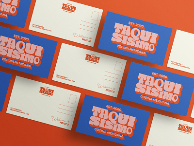
Taquisisimo is a Mexican food restaurant in Canada, which combines the best of homemade flavors with the best dishes of this beautiful country. It is a very cheerful, charismatic, warm, human, modern and fun brand. His niche is among people from 20 to 45 years old. It is also divided between people who want to know a little more about Mexican gastronomy and culture and migrants who want to feel at home, in a little piece of another country. A visual identity was proposed that could represent that homely warmth, the joy of this country and its most human side, for this reason a color palette with vibrant, organic and impressive tones was chosen. On the typography side, I was looking for one that was not with perfect strokes, so I also made some modifications, since I wanted to take something from the style of the popular signs that we see in the streets of the cities, since it is very representative and frequent . For the design of graphic resources, seek to personify some of the most representative things of this culture of different themes such as: parties, plants, animals, entertainment, gastronomy.
THIS IS A PASSION PROJECT FOR A FICTITIOUS BRAND.
