BTC Branding Pt 10
CB Design Production: BTC Branding Pt 10
Full project can be found on our Behance
Project Background
BTC is a professional eCommerce Shoe Washing brand. As the brand name suggested, BTC wants to Be The Change! They will never abandon the “old” for the “new”.
Design Goal
Find an abstract visual to demonstrate the concept of turning “old” into “new”.
Design Concept
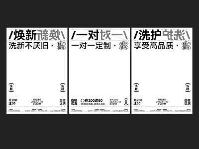
We looked into the whole Shoe Washing idea: Turn “old” shoes into “new” ones. It is Symmetrical. If we had a central axis, then the “Old” and the “New” will be placed on the opposite sides of the axis. We implemented this central axis concept into the BTC logo design process, when we designed the initial letter “C”, we intentionally mirrored it to create a sense of turning “old” into “new”.
The symmetric central axis concept can also be found in the brand visual system. We used dashed lines to separate the “old” and the “new”, semi-transparent titles/shapes indicates the “old”, where solid filled titles/shapes represents the “new”. The “Old” and “New” are always shown together, which responds to BTC’s Never abandon the “old” for the “new” belief.
We certainly hope you like it. Thank you.