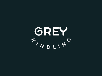
Wordmark Logo Design
Company name: Grey Kindling
Description: A company that makes and
distributes all-American snacks
Brand values: Made with loved and served
in your favorite diners.
Target audience: Married couples
Goal: Convey a sense of wonder while at
the same time being old-fashioned, prefer a
wordmark that uses the color white. The logo will
be printed on the sides of vehicles.
SOLUTION: I Made the letter G of the brand name
Grey Kindling into a symbol of love and oneness of
couples. And the Y letter of the brand name was made into an
awe expression, conveying a sense of wonder.
I would love to know your thoughts on this
Follow me for regular updates.
More by Iisominea Amos View profile
Like
