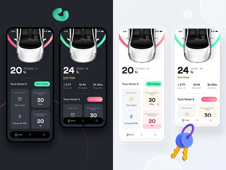
Smart Car Charge app Dark+Light (Version 2)
This is the 2nd prototype design crafted for Smart charge app. It includes both dark and light versions of the Home Screen. This is basically the home screen that shows two states:- Charging and not charging. For more, please scroll down and get a more detailed analysis
Light mode for the home screen. I am giving detailed analysis of different components and functionalities and what they stands for.
Dark mode for the home screen to enhance visual ergonomics and make it more contemporary, edgy, and eye pleasing. It also helps to save battery and is easy on human eyes.
509.4.Home_charging.png
400 KB
509.3.Home_not_charging_scroll.png
400 KB
509.2.Home_charging.png
400 KB
509.1.Home_not_charging_scroll.png
400 KB
More by Prakhar Neel Sharma View profile
Like


