Caler Edwards Rebrand
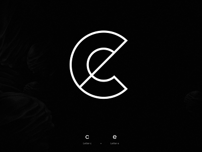
New logo for my personal brand.
I tried to find a good balance between the letters c and e. I wanted the letter c to be the first thing you see when you look at the logo.
I find that most ce logos draw your eye to the letter e a little more than the letter c. I hope you like it!
More by Caler Edwards View profile
Like
