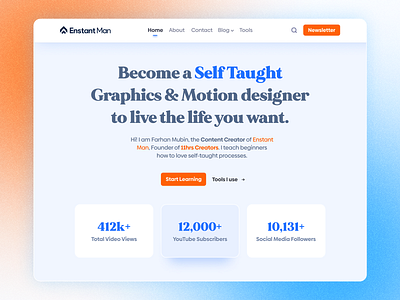
Minimal Website Landing Page design - Hero Section
Hi 👋 Dribbblers!
My recently revramping of the website landing page of Enstant Man. Gone for a Very Simple and Clean Layout design. No Graphics elements has been used.
Making it Clean and Bold without making it croowded was the Main Goal of this Redesign. I hope you will love it.
💬 Any suggestions on this website's Hero Section design are extremely useful.
💙 Press "L" if you loved it :)
😉 Currently Available for:
🔥 UX/UI Design
✅ Webflow Development
✅ Wordpress Website
✅ Branding Projects
Want to Get started with your next big project?
(◕‿◕) Reach out to me here: himubin22@gmail.com
Thank you for stopping by and seeing my post.
More by Farhan Mubin 🌿 View profile
Like
