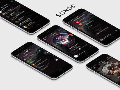
Sonos Player redesign
I got my first Sonos speaker system the other day. While I think the quality of the sound the speakers produce is top class, I feel like their app leaves a lot to be desired in both terms of design and functionality. In a lot of ways it is real quirky with how it functions, so for fun I redesigned it.
Starting with the player itself I redesigned the look and feel to make the album artwork have more interest and make the player controls and the album artwork have more connection and a more cohesive experience. So the progress indicator of the song is right in the ring around the artwork, while the next and the back are centrally located along with the progress rings as well (with the play button overlaid over the artwork also). I think a lot of thoughts for functionality could be utilized as off canvas navigation, with the speaker configuration option and the intro screen options as well. The playlist could float up over the player. Another thing that bothers me when in the player view, is using the various music services and no indication of what you are using (if it is spotify, sound cloud etc) so I added in an indicator of that as well.
If you are unaware of Sonos’s current player, you can preview it here. You can obviously see my ideas and concepts here :)


