McPolanders Lettering
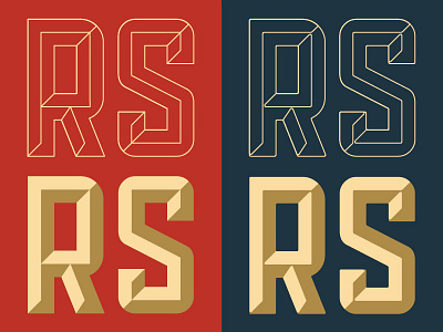
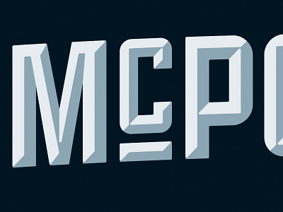
I outlined and modified the Public Gothic Square typeface in Illustrator for the "McPolanders" logo, adding the bevels myself. Originally, I drew everything at perfect 45-degree angles to make life easier (left), but when I was done, I used Illustrator's new "Live Corners" feature to selectively apply rounding to the hard corners (right)... which gave everything a slightly softer, more organic look, especially where the bevels meet each other. Look at it @2x to see the difference properly!
More by Cameron Booth View profile
Like

