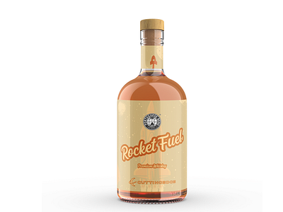
Rocket Fuel Whiskey
For this project, the company wanted a retro look with orange colors. To achieve the retro look, I chose a script font that I liked and made a rocket icon to attach to the writing to complete the logo. I chose to put the logo on a 15% incline, as to add more character to the design.
More by Matt Brophy View profile
Like
